Purpose of using MBTA maps
Signage Rating by MBTA users
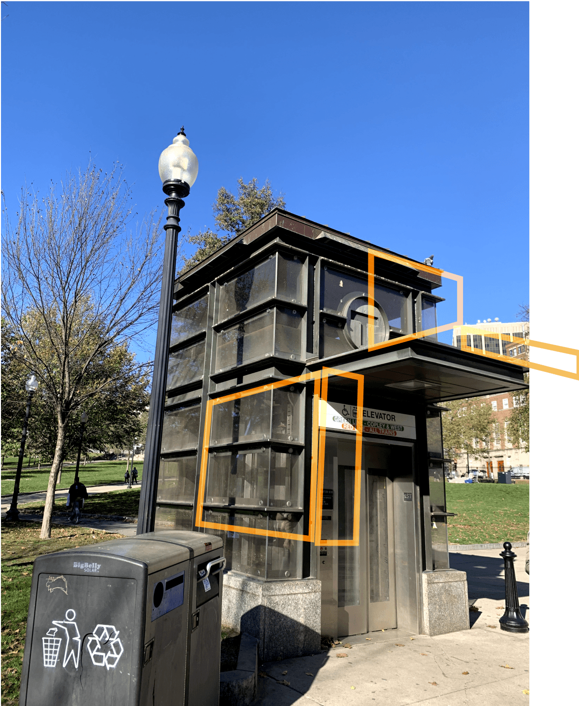
Problems with maps outside the station
Visibility/Readability
Use of color
Size (Scale)
Effectiveness
Use of word
Use of color
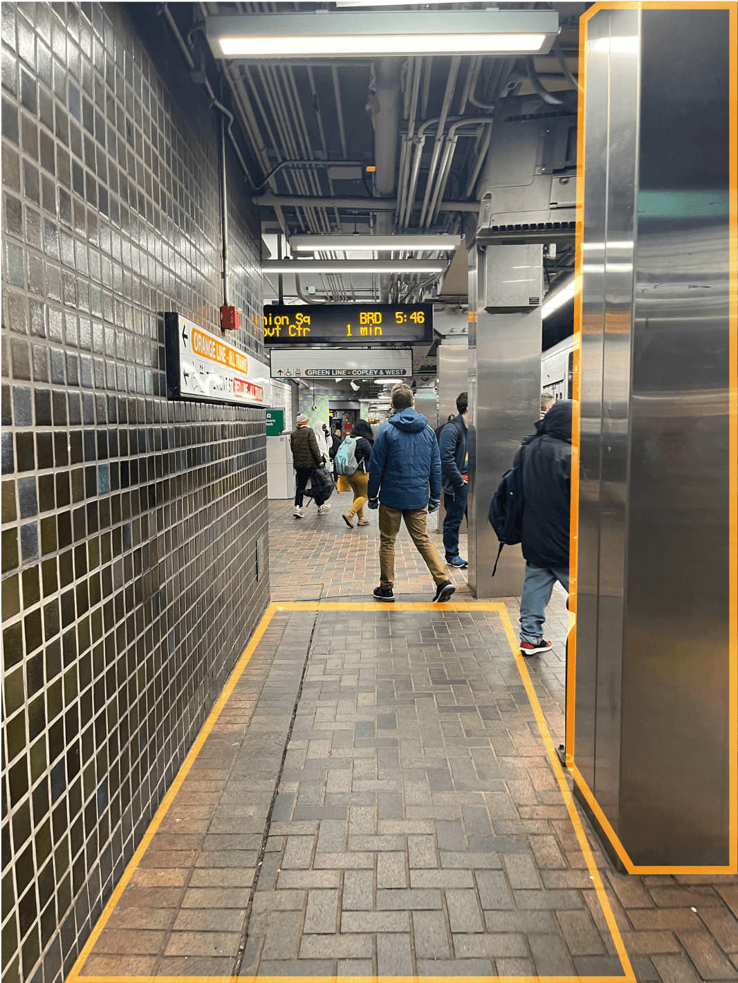
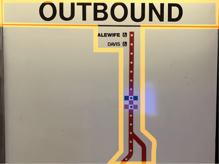
Problems with the map inside the station

Visibility/
Readability
Visibility/
Readability
Hard to know
where I am
Hard to know
where I am
Lack of
useful
information
Lack of useful
information
None use of color
None
Finding entrance
Finding
the correct
platform
Finding a way to transfer
Finding amenities
(i.e. restrooms,
ticket machines)
Finding
the correct
exit
N=15
N=15
N=15
N=15


Poor
Excellent
Good
Okay
Weak
Further Survey
With the concept we decided on, we conducted a survey to find out the problems with the current signage. The survey surveyed people's thoughts on the sign of MBTA through interview participants and 6 other MBTA users, a total of 15 people.


Hope I am going the right way

Where is the green?

Which track?
T
?
20 MIN
?
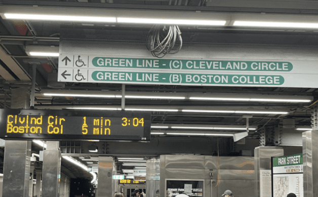
Green line E
Green line D
3 MIN
Green line B


Will I have to tap again?

Do all Green Line trains run on same platform?
5 MIN
Union Square?
Where is it?
Is it going to Lechmere?
?
Walks toward Park St
Green Line location unclear
Unsure if the transfer is free
Unsure where Green line is
Upstairs?
Finds sign to Green line
Waiting
Crosses track to be in between trains
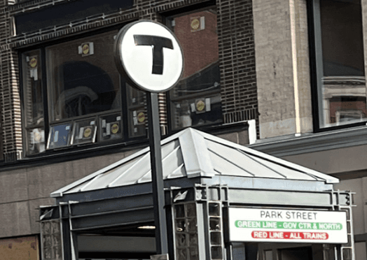
Park Street Station
Find correct elevator
Board train
Walked to the incorrect entrance
Unsure which train to take
Ask for
help
A
B
C
Downtown Crossing Station
Park Street - Red Line
Transfer
Park Street - Green Line
Park Street Station
Transfer
Board train
Board train
Board train
Board train
Waiting
Long wait for train, looks for transfer options
Tourists trying to take Green line towards Lechmere with their kids.
Pain Points
Unsure which elevator entrance to use due to lack of signage
Walking to the incorrect entrance because there is no large exterior signage
Unsure which train to take because lines aren’t explicitly labeled
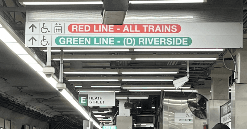
Commuter traveling from Downtown Crossing to Park St Green line E.
Pain Points
Unsure if going in the correct direction down the corridor due to lack of signs
Unsure where Green Line is because the signs are hidden or blocked
Unsure which track the train will arrive at because lines aren’t explicitly labeled
Commuter traveling through Red Line wants to switch to Green line B.
Pain Points
Unsure where the Green Line is located within Park Street Station
Unsure if the transfer is free between Red Line and Green Line
Unsure if all Green Line trains will run on same platform
Scenarios
We developed three scenarios based on our previous research (interviews, field research, and survey) to address the MBTA rider’s pain points and find out potential touchpoints.
Trying to find correct elevator entrance


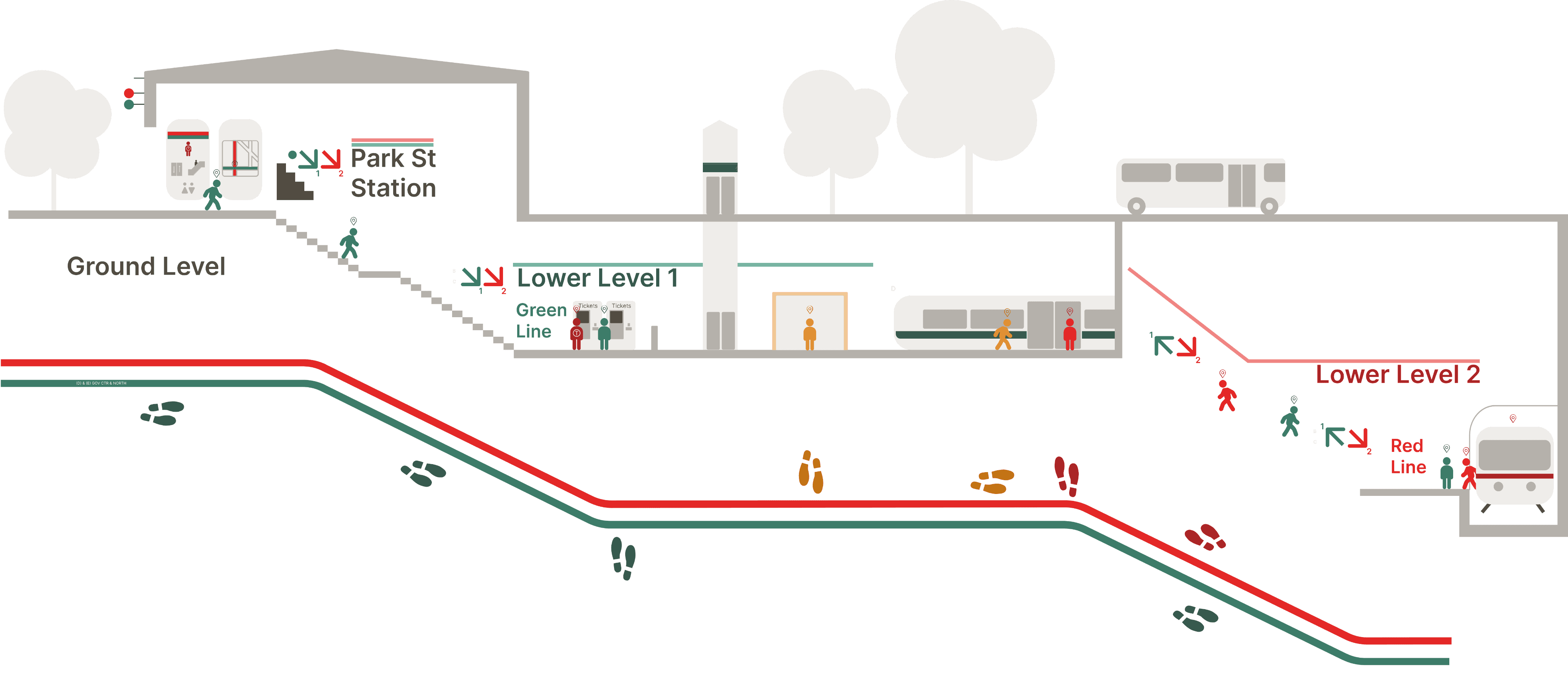
Braintree/Ashmont
Alewife
Lower Level 1:
Green Line
Ground Level
Lower Level 2:
Red Line
Downtown Crossing
A-1
A-2
B-1
B-2
B-3
C-1
C-2
Scenario C
PARK STREET STATION
Scenario A
Scenario B
Scenario C
Scenario B
Touch points of information to ensure the rider knows where they are located within the MBTA system.
There is existing signage within the MBTA system, but there needs to be enforcement of where the information exists and how you can access it.
Defined locations of amenities and location tools to reduce time looking around and searching.
How do you know where you are ?
“You Are Here”
Data Synthesis
What stops people from achieving their goal?

Payment
Required reload
Unclear payment method
Limited machine location

Incorrect
real time info
Incorrect
departure time on app
Outdated map
Identifying
Location
Identifying
Location
Unreadable map
Unclear words and signs
for direction
Based on the research findings, our team could find three barriers; Payment, Incorrect real-time info, and Identifying location. We brainstormed concepts for each barrier, and we decided our concept to
“You Are Here.“

Ideation for concepts

LessUrgent
Less urgent &
Important
Urgent
&
Important
Urgent
&
Less important
Less urgent
&
Less important
Urgent
Important
Less
Important
How can we announce a delay due to the accident to people other than the departure time screen?
Should we have to go stations and certain locations to get a Charlie card?
Can we pay with other than a Charlie card and cash?
Can we pay for tickets online while we are near the station?
How can we convey the train running express to passengers waiting on the station?
How do you know where you are?
Can we align station’s departure screen system and time of way finding app?
How can we provide real time info to passengers on street level stations or bus stops?
How can we make bus/street station passengers know the actual arrival time without having a fancy screen?
If someone misses their train due to incorrect information, how do they plan their trip?
Do we have to pay in person?
📌
📌
📌
📌
📌
📌
📌
📌
📌
📌
📌


*Yellow: Where need improvement or new signage

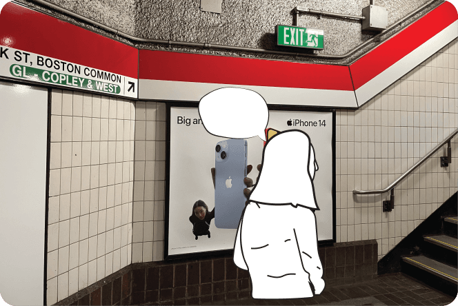
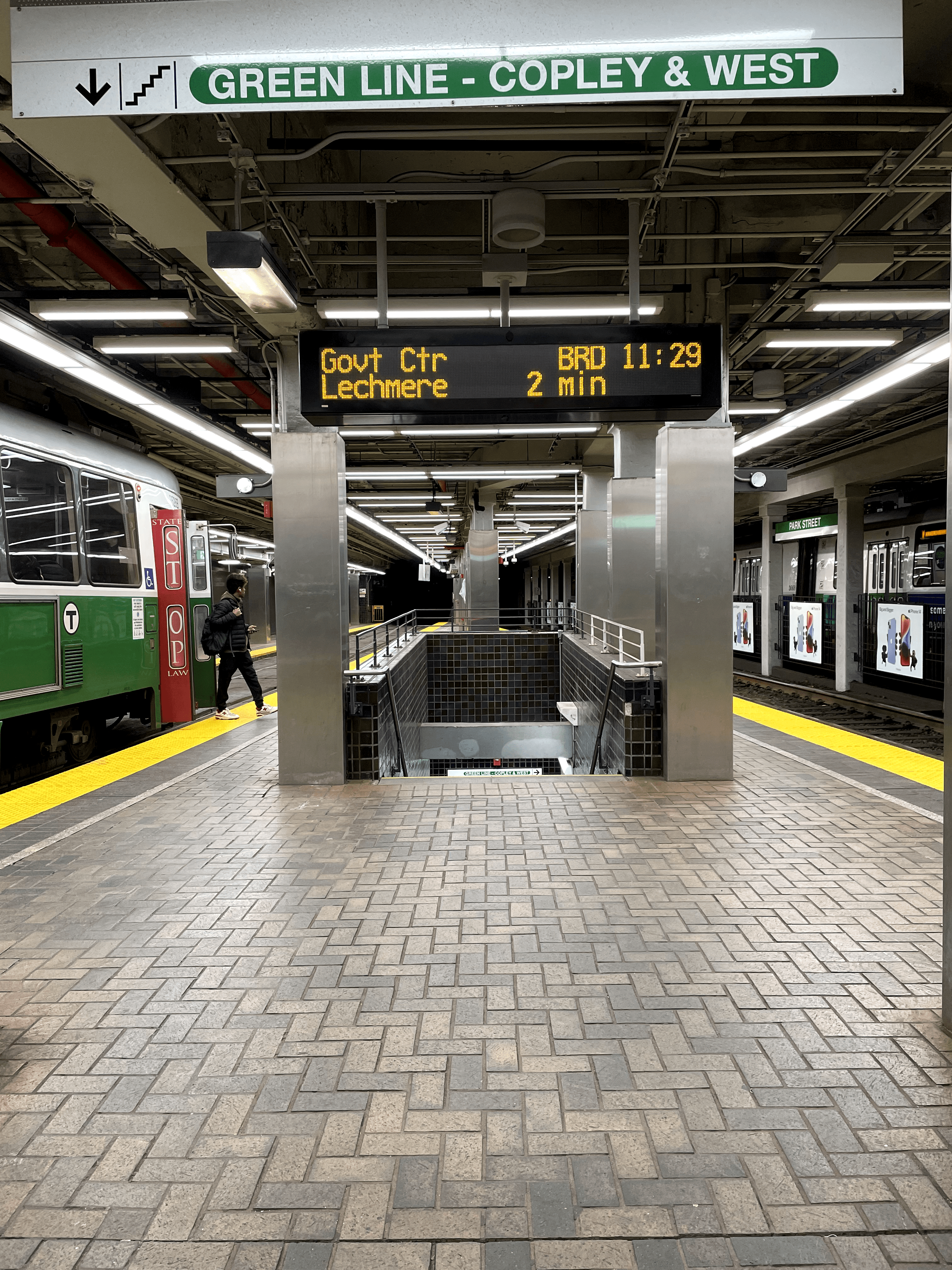
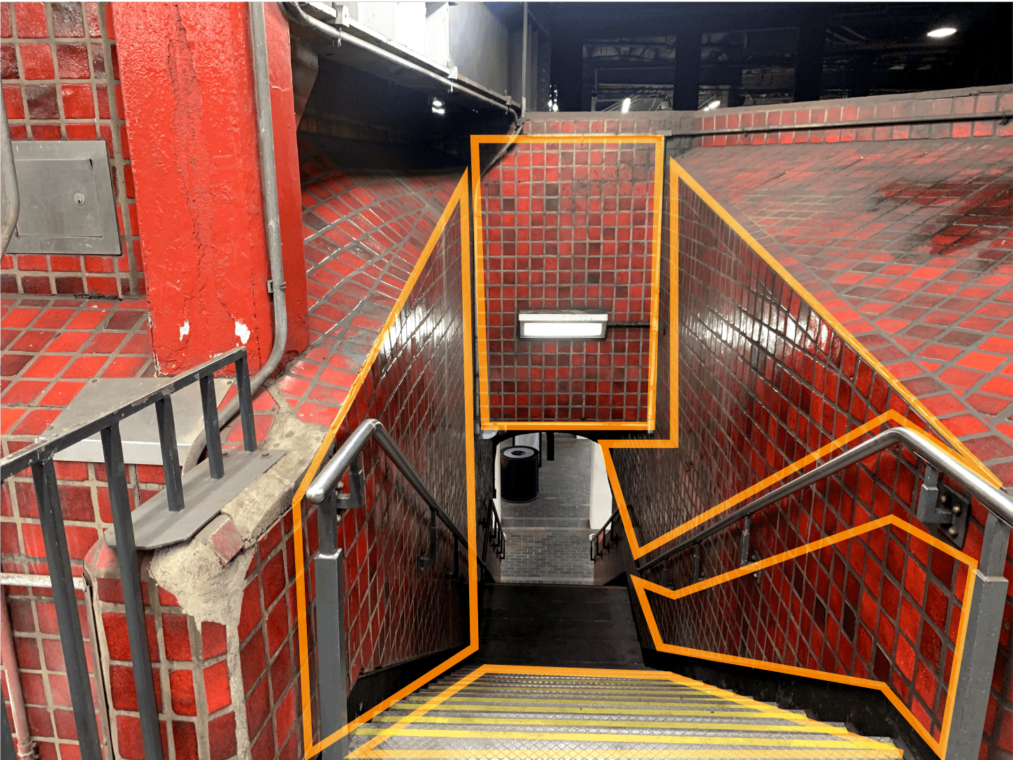
Our team observed people using the MBTA system for weeks and visited 10+ stations.
We observed people find it hard to find their way inside of complex transfer stations and some information is disconnected.
Field Research
Popular station for tourists and commuters
Complex structure and many lanes
Many points missing signage and directions
Clueless color coding
Developing Interview Guide
Interviews
Codebook & Coding
Analysis
Interview Process
Identify Participants
Script the encounter
Brainstorm question
Prototype & Protocol
Recruit participants
Schedule interviews
Record interviews
Transcribe recordings
Keywords from the transcripts
Code revisions
Interview coding
Create summary of each theme
Interpret findings
We interviewed a total of 9 participants in Boston for our research regarding the MBTA.
Participants chosen were from the pool of friends and close acquaintances.
Our research sample set consists of 4 visitors, of which 2 were male, and 3 were female. And the other category was 5 female commuters.
We did a second round of interview (questionnaire form) after defining way finding as an issue which we could improve.
The questionnaire was open to people, and we recorded responses from 15 participants. We wanted to understand how do the perceive current way finding signage
Interview Participant Recruitment
I
N
T
E
R
V
I
E
W
P
A
R
T
I
C
I
P
A
N
T
S
V
I
S
I
T
O
R
S
C
O
M
M
U
T
E
R
S
I
N
T
E
R
V
I
E
W
P
A
R
T
I
C
I
P
A
N
T
S
S
I
G
N
A
G
E
F
I
N
D
I
N
G
W
A
Y
T
o
T
R
A
N
S
F
E
R
M
A
P
S
N=15
57.9%
60%
80%
Lack of Information
Confusing transfers
Visibility/ Readability
Where am I?
“I had to use multiple sources needed to get one bit of information because they were all missing something.”
- P1
“I was in a hurry and got in wrong train, and so I wanted to go to Boston College, but I got on a train to Government center. So I had to switch from there.”
-P4
“Read sideways vertically to figure out what stop we were going to and count. I had to crane my head a lot.”
- P2
“I look for the familiar spots or familiar thing which helps identifying me the station and where I am so that I don’t feel lost.”
- P8
“ How can we improve wayfinding methods at stations for location context and transfers? ”
EMPATHIZE
DEFINE
IDEATE
PROTOTYPE
TEST
Field Research
Observations
Recruitment of participants for interview
Conducting semi-structured interviews
Synthesizing
Grouping data
Choosing leverage points
Defining problem statement
Precedent study
Taxonomy
Brainstorming ideas for all the leverage points
Design Experimentation
Modifying the existing signage
Creating new signage
Placing the signage in strategic locations
Comparing and rating our design proposal with current MBTA signs
Taxonomy of our signage
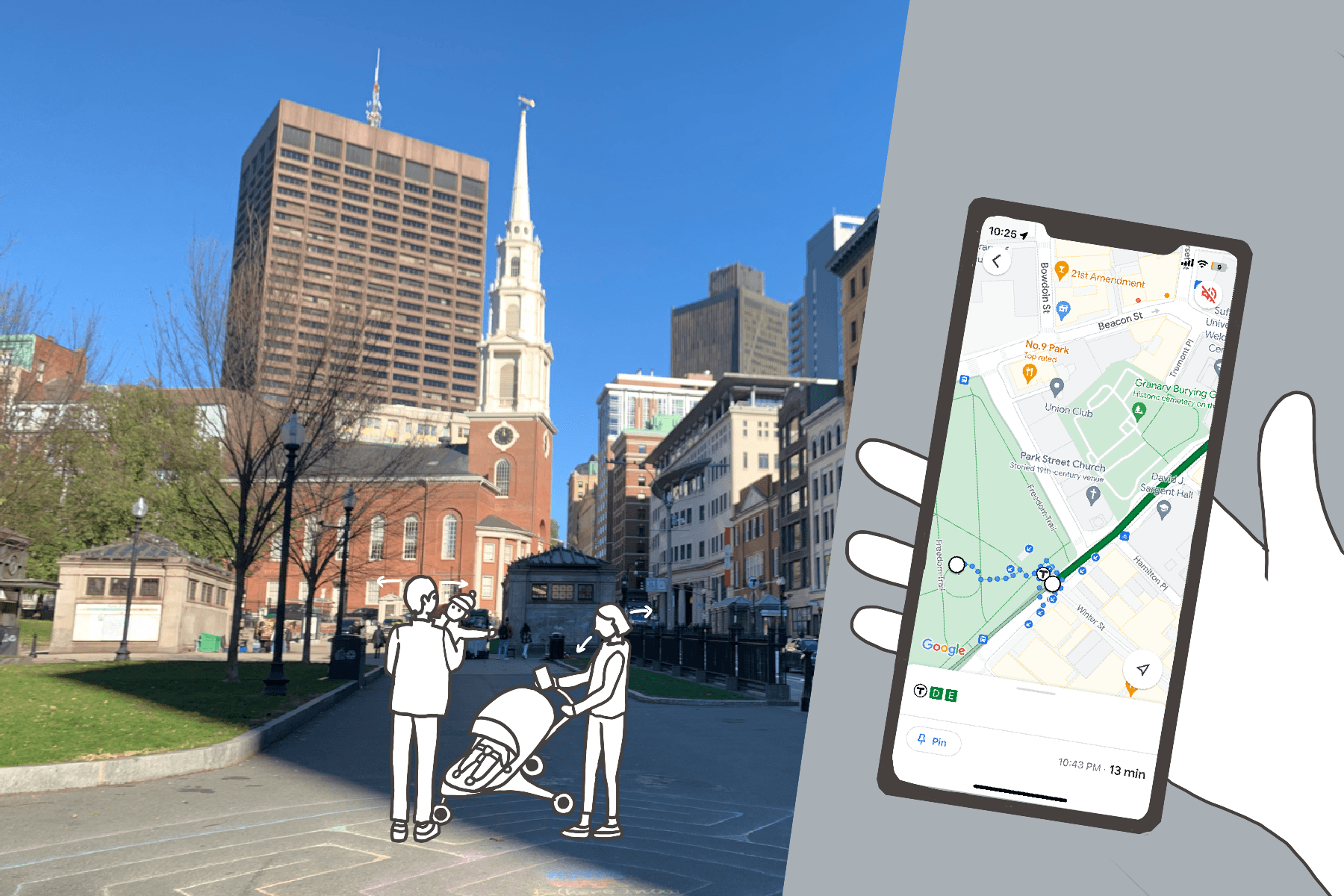
The MBTA, the Massachusetts Bay Transportation Authority, is the public transportation system in the Boston area. It is the oldest public transportation in the United States, and many tourists and commuters rely on the MBTA.
However, despite the city's being full of tourists, students, and office workers, the MBTA experience could have been more pleasant than other big cities.
This project was started to find out the cause of the low-quality experience of the MBTA riders, identify riders' behavior and context, and provide design solutions so that people's journeys can be enjoyable.
View the design intervention..💡

Project Overview
Disha Rathod • Lindsey Petchel • Sohee Kang
Mentor: Tad Hirsch
4 months | Sep 2022 - Dec 2022
Figma, Miro, User Testing, Adobe Illustrator
Role:
Contributor:
Timeline:
Tools:
UX Researcher • UX Designer • Graphic Designer • Spatial Designer

MBTA
(Massachusetts Bay Transportation Authority) | Wayfinding Signage Project